We designed the app icon for Healthable, an all-in-one mobile hub that gives Medicaid and D-SNP members instant, on-the-go access to their ID cards, telemedicine, and health coverage.
Managing your health should empower you to enjoy your life, not act as another stressful chore you have to worry about.
We designed the visual identity to reflect empowerment and ease rather than medical obligation. By prioritizing absolute clarity and approachability, we created a clean, highly accessible app icon that distills the core purpose of Healthable into a single, effortless glance.
We built the new design directly upon the existing Highmark Health brand and icon universe. This allowed us to leverage established corporate trust while injecting a fresh, highly accessible aesthetic that feels unique and welcoming to the Medicaid audience.
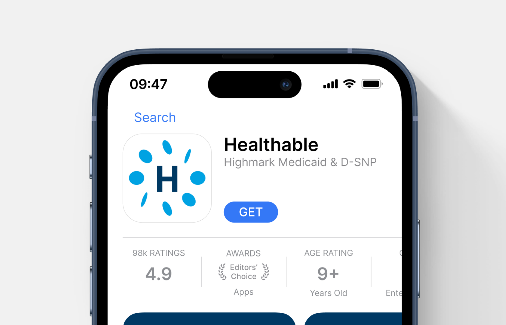
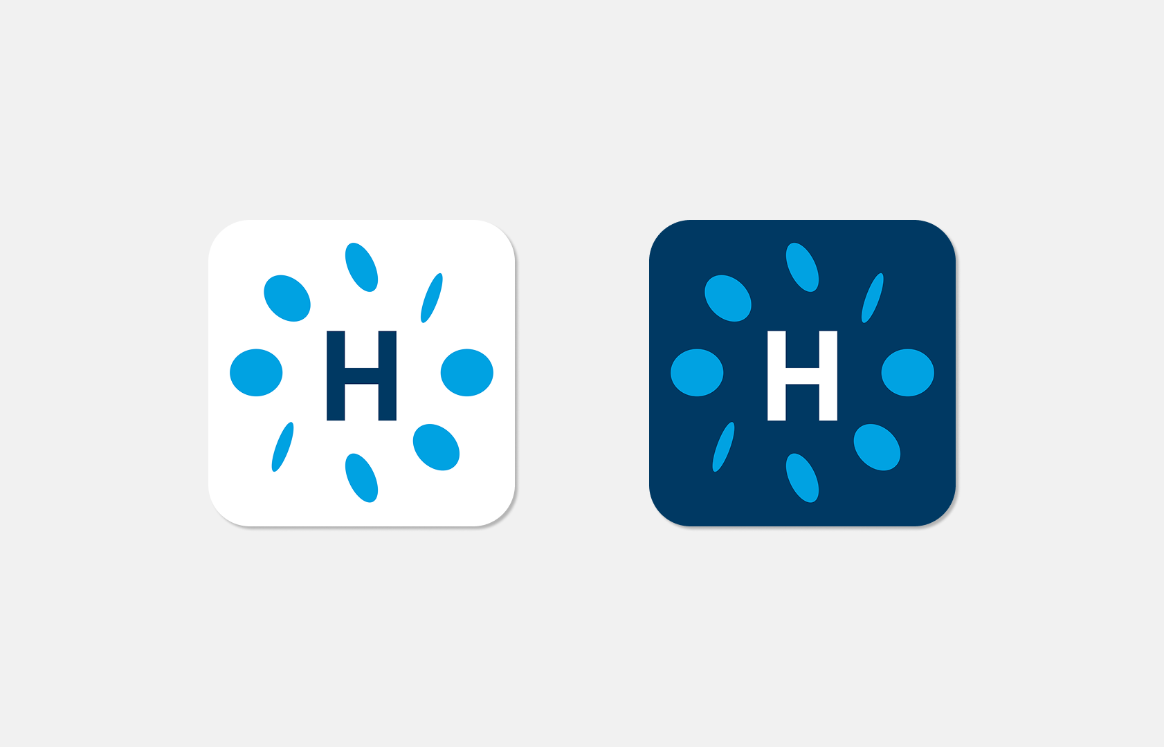
By turning a complex health insurance utility into a friendly, approachable digital asset, we ensured the first step to managing personal health is the easiest one.