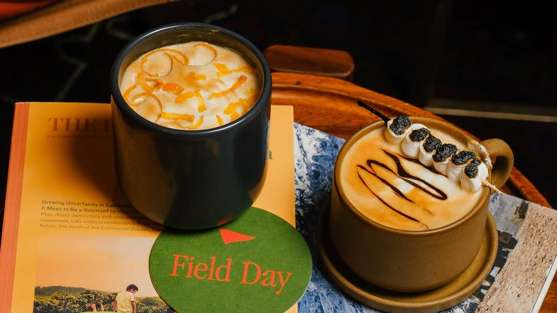
A full digital overhaul designed to align Field Day’s online presence with its edgy, energetic physical space, transforming a clunky, outdated website into a vibrant, seamless booking engine.
No matter how incredible the physical space waiting on the other side is, a jarring and confusing digital journey is the ultimate procrastination fuel for first-time bookers.
We ditched the guesswork and conducted on-site user interviews to map a bulletproof awareness-to-booking pipeline. Then, we wrapped a newly centralized, third-party booking system in a bold visual language that actually looks and feels like Field Day.

We ditched the guesswork, conducting on-site user interviews to map a bulletproof awareness-to-booking pipeline. This informed a totally streamlined flow, powered by a newly integrated, centralized external booking partner.
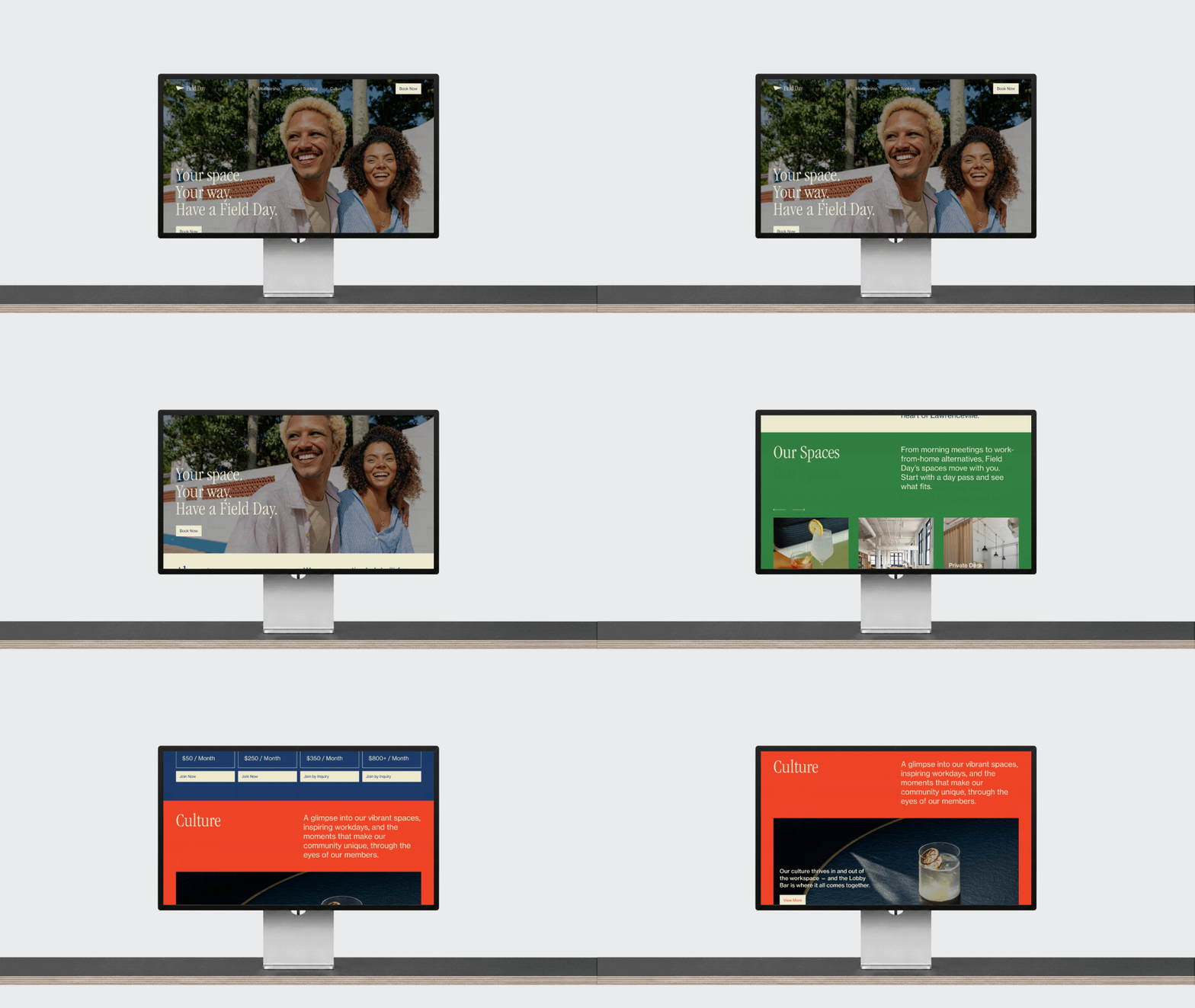
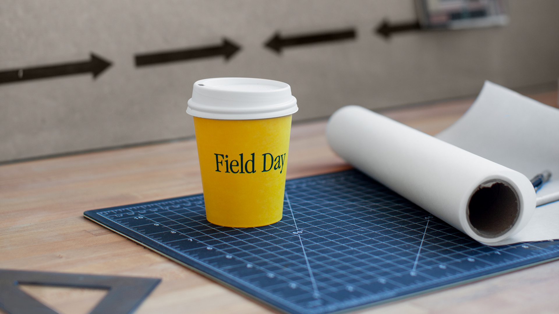
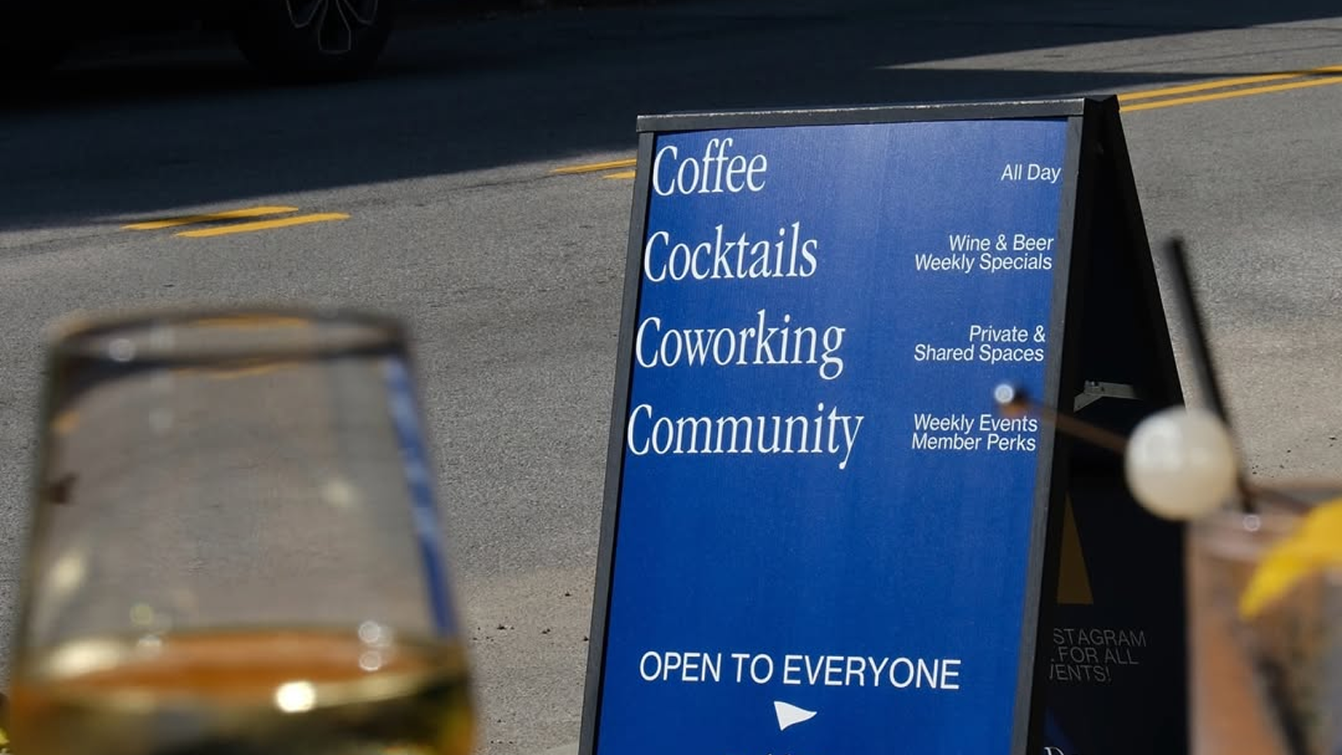
We built a bold, energetic visual language that doesn't just live on the screen. The cohesive branding system scales flawlessly from the digital interface into subtle physical touchpoints across the space, from the coffee shop to the lobby bar.
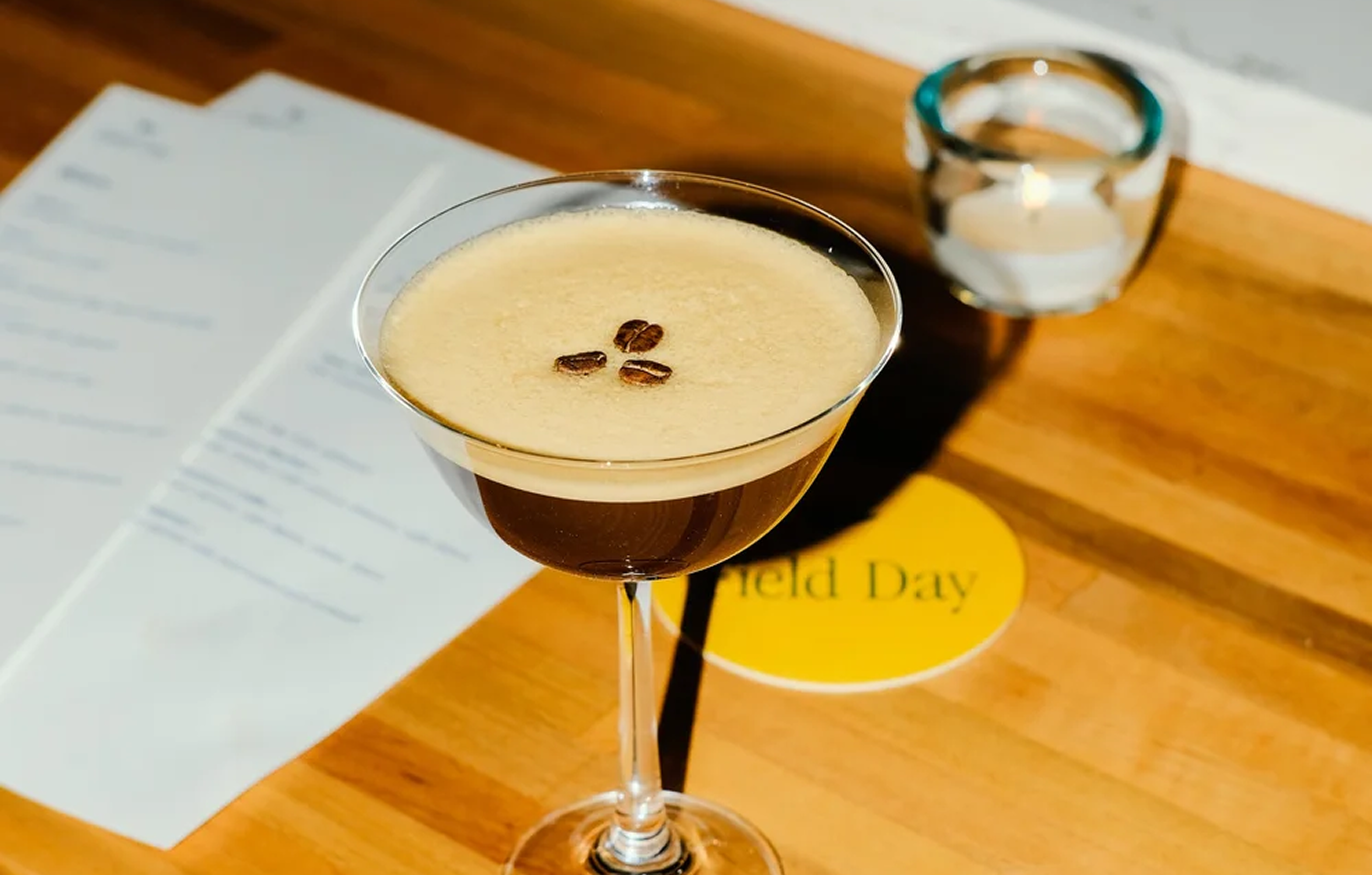
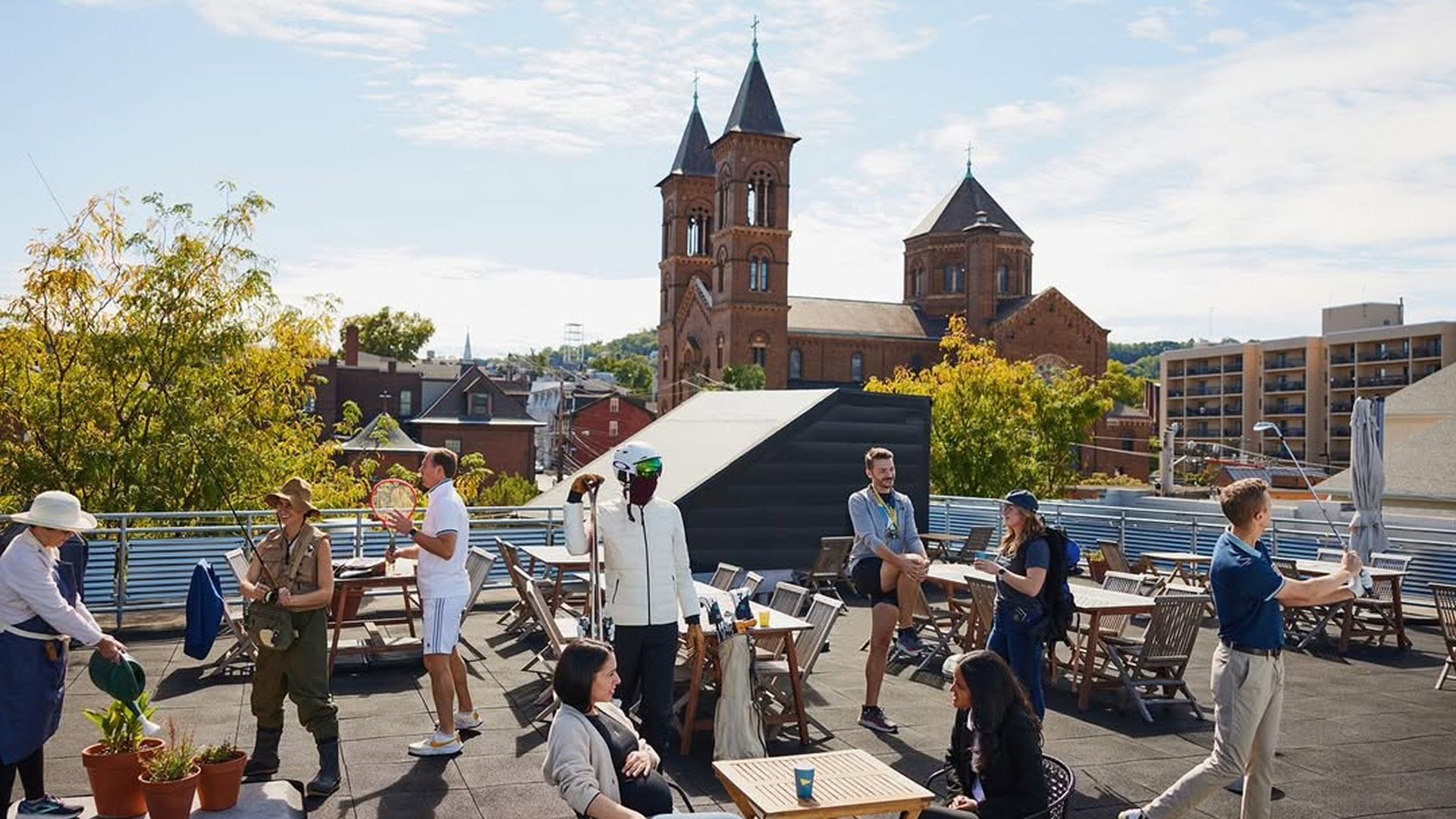
By aligning the digital aesthetic with the physical vibe and untangling the backend mess, we turned a massive point of user friction into a high-converting growth engine that the internal team actually loves using.
spike in day-pass bookings in the first 5 months.
internal staff satisfaction with the new centralized management system.