We elevated a promising skincare tech startup into a premium beauty brand, seamlessly blending their high-tech skin analysis capabilities with the timeless elegance of traditional beauty rituals.
Revealing your skin’s naked truth is an act of vulnerability that requires the warmth of a timeless ritual, far beyond the cold precision of a tech gadget.
We rooted the brand in a simple philosophy: the first step to advancement is acknowledging your raw nature. To soften the intimidation of the technology, we wrapped Solomomo’s precise skin-reading capabilities in the elegance of traditional beauty rituals, turning a moment of vulnerability into a premium act of self-care.

We designed a circular logomark directly inspired by the traditional Chinese Guasha stone—a visual anchor of simple elegance that ties the brand back to the foundational ritual of discovering and treating one's authentic skin.


To immediately position the brand in the high-end space, we developed a signature orange gradient system that radiates a soothing, premium ambiance across every physical and digital touchpoint.
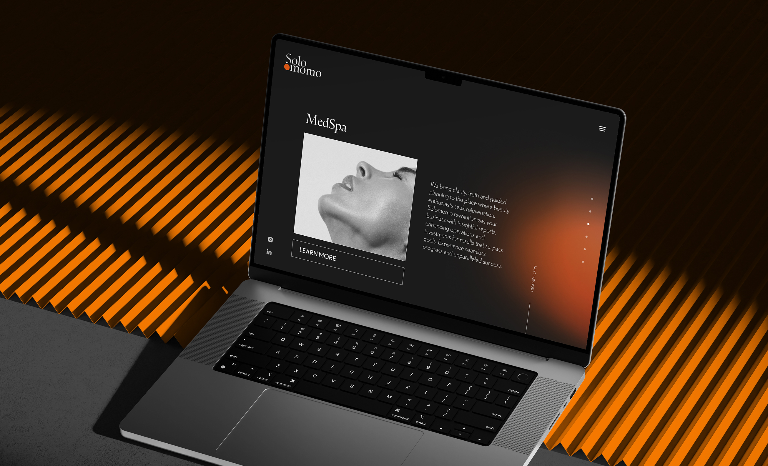
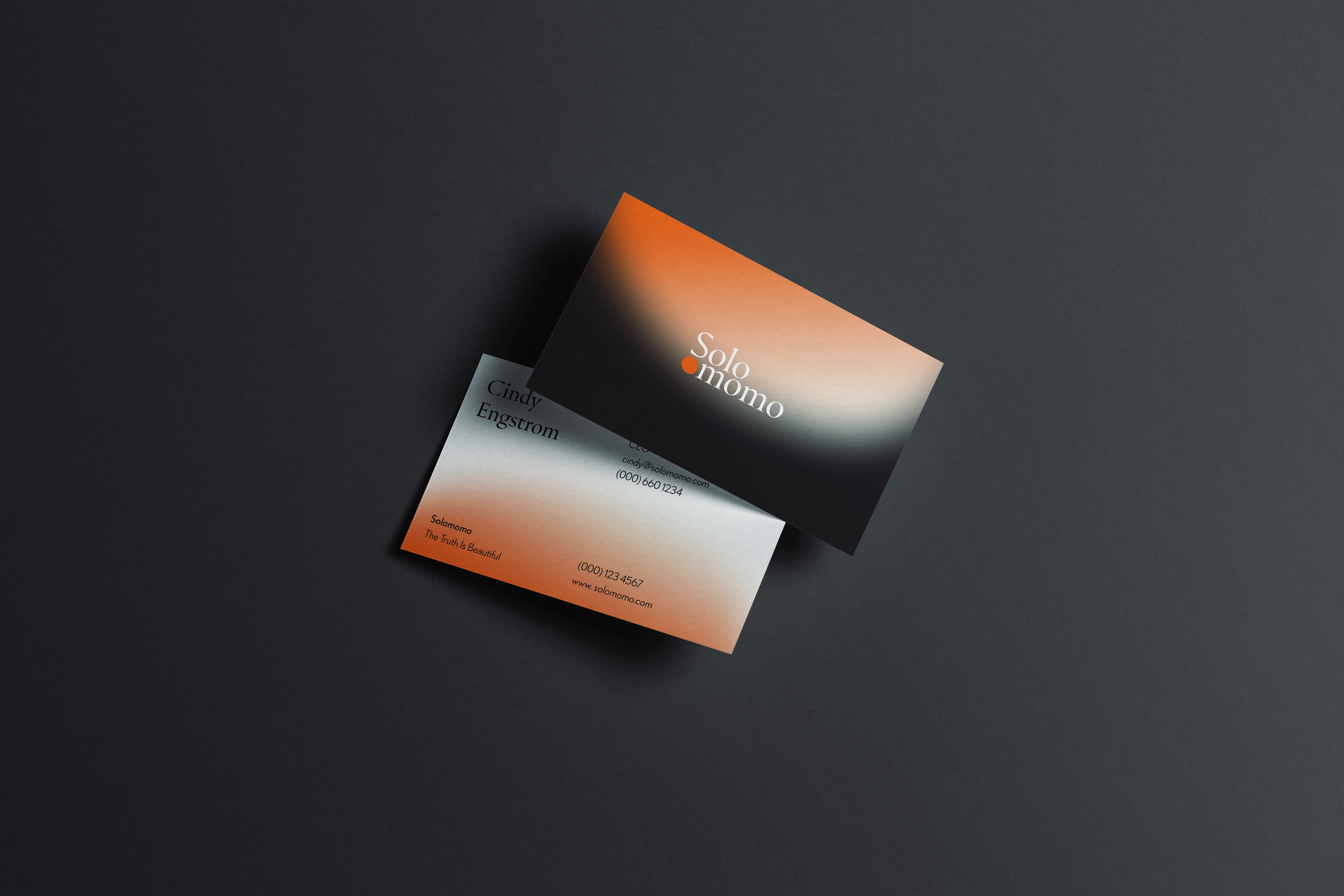
By replacing clinical startup vibes with the elegance of an ancestral beauty ritual, we successfully repositioned Solomomo with the visual cachet required to confidently court the luxury skincare market.